
Welcome to Pinpoint, a weekly digest for marketers and leaders. In every issue you’ll find timely industry news, perspectives from experts, actionable marketing strategies, and links to other resources that can help you grow your business.
In this special weekend edition, we’re taking you all the way back to the 1960s to tell you the story of how Mary Wells Lawrence used her advertising prowess to help usher in the golden age of airline travel.
The year was 1965 and the people behind Braniff International Airways were tired of being the small fish in the big pond.
An insurance entrepreneur named Troy Post had recently purchased a controlling stake in the airline, and Post wasn’t happy that Braniff was virtually unknown by travelers.
So he decided to do something about it.
“I need a very big idea for this airline, something so big it will make Braniff important news, overnight,” he said to one advertising executive.
Troy decided to hire famed advertising agency Jack Tinker and Partners and put the responsibility of breathing new life into his airline into the hands of one of their brightest and most effective advertising executives.
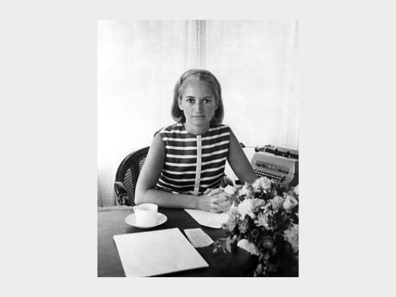
Her name was Mary Wells Lawrence.
At the time, Mary was at the top of her game. She had been busy developing some of the most memorable and effective advertising campaigns and advertising copy of the decade.
Mary began her work with Braniff International Airways like any good marketer or advertiser should—with research and discovery.
Here’s an excerpt from her book, A Big Life in Advertising, that explains more:
“Even before we were officially hired to work for Braniff, Jack and Stew and I started to visit airports in New York, Washington, Chicago, Denver, Dallas and other cities on Braniff’s system. We hiked through miles of terminals, I was getting claustrophobic in them, depressed. Then one morning, standing by a check-in gate in Chicago, I turned around and I saw a jail, the army, a prison camp, a ghastly desert and a lot of grey people. I’m having a nightmare, I thought, but it was just the terminal. Airlines had developed out of the military and modern marketing hadn’t discovered them yet. Planes were metallic or white with a stripe painted down the middle to make them look as if they could get up and fly. The terminals were greige. They had off-white walls, cheap stone or linoleum floors, grey metal benches, there were tacky signs stuck onto walls any place at all. Even the doors to the first-class clubs were hidden behind stairways, those doors never had a frame, they looked like cupboard doors for mops. Stewardesses, as they were called, were dressed to look like nurses or like pilots who could fly the planes in case the real pilot had a heart attack. There were no interesting ideas, no place for your eyes to rest, nothing smart anywhere. And there was no color.”
Mary walked away from that experience knowing exactly what Braniff needed: color.
She quickly hired two internationally renowned designers to flip the Braniff International Airways completely on its head: interior and textile designer Alexander Girard and fashion designer Emilio Pucci.
One article about the campaign describes Girard this way:
“Girard was a trained architect who became one of those Modernist designers to try his hand at everything—textiles, furniture, objects, interiors, toys, graphics, and more. He was known for a humanistic approach to design. Departing from the white-walled minimalism of the earlier Modernists, Girard valued color, folk art, and designs that evoked joy and delight.”
For the rebrand to work, Girard would need to shape an entirely new experience for Braniff customers, one that was bold in more ways than one.
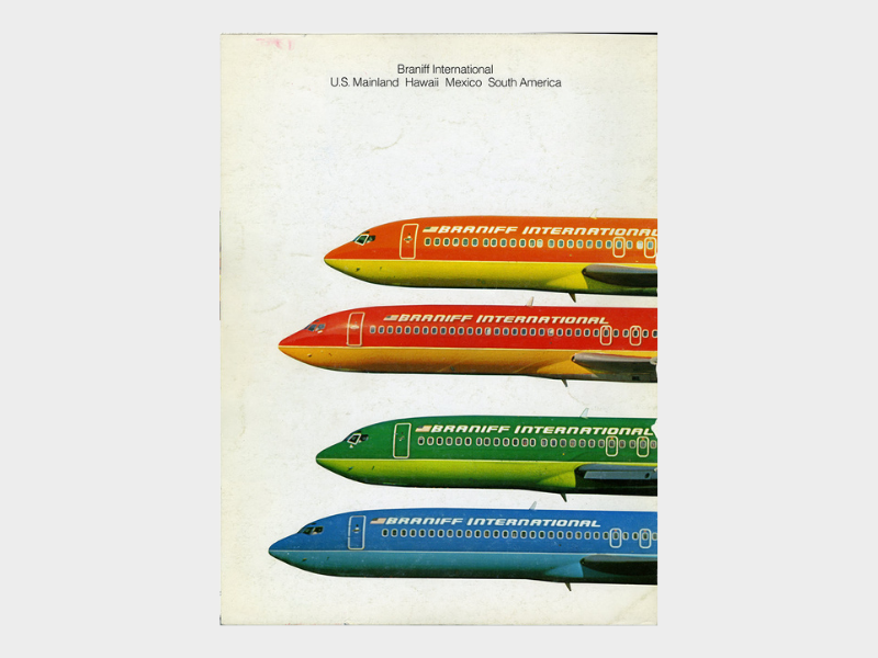
The biggest notable change that Mary and Girard both insisted on seemed unimaginable at the time: they would put bold colors on the exterior of the airline’s entire fleet of planes:
“The airline’s fleet was painted with a palette of soft pastels and bright primary colors, the plane seats and carpet upholstered in Girard textiles, and the in-flight experience packaged and presented in a typeface designed by Girard, with a custom bird logo, “The Bluebird of Happiness.” His typographic treatments and bird silhouette appeared on everything from matchbooks and glassware to timetables, stationery, badges, and ashtrays. He designed posters featuring art from South America for Dallas/Fort Worth International Airport’s lounge, and furnished it with pieces by Charles and Ray Eames—his colleagues at Herman Miller. It was a project most designers could have only dreamed of, and one of unprecedented scale.”
— Billie Muraben, The End of the Plain Plane
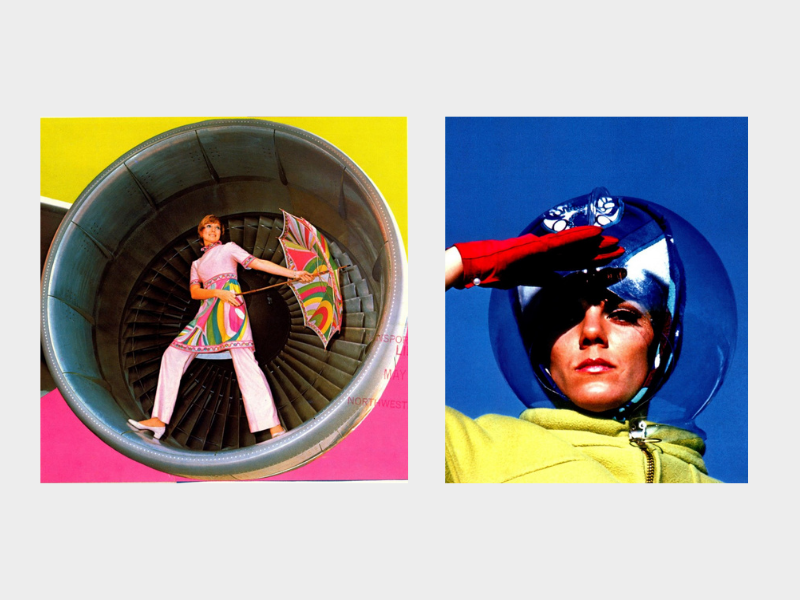
Emilio Pucci’s role would be to design new uniforms for the flight attendants that would mimic the bold colors and identity that Girard was creating inside and outside the plane.
“The uniforms designed by Emilio Pucci were another revolutionary spin on the characterization of air travel. Where air stewards had previously been presented as staid experts in safety, at Braniff, they were reappointed as “air hostesses,” dressed in uniforms that reflected contemporary fashion trends.”
— Billie Muraben, The End of the Plain Plane
When it came time to promote and introduce the new brand to the world, Mary gave three unforgettable lines of copy to Braniff:
- “You can fly with us seven times and never fly the same color twice…”
- “We won’t get you where you’re going any faster, but it’ll seem that way.”
- “The end of the plain plane.”

The campaign changed airline advertising and branding forever, as Mary notes in a chapter in her book:
“It was the end of the plain plane. Airline advertising and marketing and design would never ever be the same. There were groans from other airlines. They complained that the paint made the planes heavy–every airline that told that silly story is now flying fleets of painted planes.”
— Mary Wells Lawrence, A Big Life in Advertising
What happened to Mary after the launch of such a successful campaign? After being denied a promotion that she felt she had earned and deserved, she ultimately decided to launch her own agency, Wells, Rich, Greene, Inc. (WRG), which created some of the most famous advertising campaigns in history.
Until Next Time
For this special weekend edition, let us leave you with a quote from Mary Wells Lawrence herself:
“The best advertising should make you nervous about what you’re not buying.” — Mary Wells Lawrence